
Cumulative Flow Diagram (CFD)
See work-in-progress, flow rate, and stability at a glance — plus the Throughput Run Chart on the same tab.
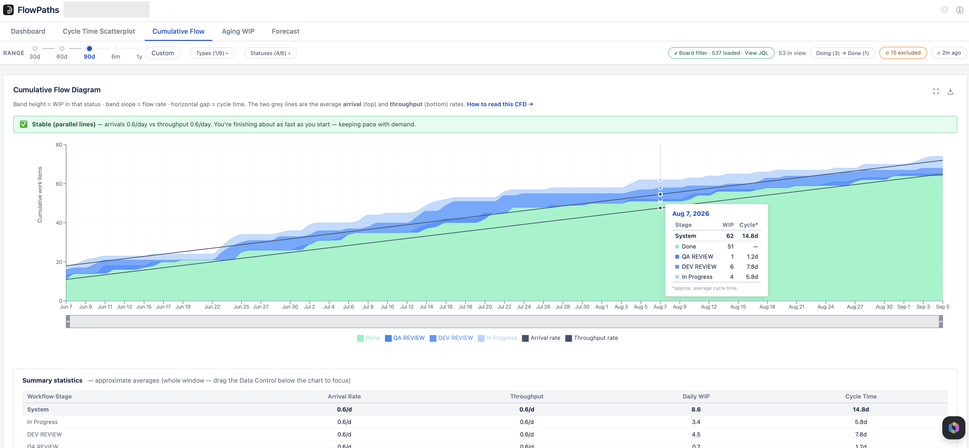
A CFD shows how work accumulates and drains at each workflow stage over time. The construction rules aren't cosmetic — they're what make the signals below actually readable.
The four things you can read off it
- The top line is cumulative arrivals into the process; the bottom line is cumulative departures (Done).
- It's cumulative, so no line can ever decrease.
- Vertical distance between two lines = total WIP between those steps (the band height).
- Horizontal distance between two lines ≈ the approximate average time items spend between those steps.
One trade-off worth knowing
Each line counts items that have reached a stage or beyond, so a line can only go up, never down. That means if an item moves backward (e.g. it's reopened), that doesn't show up as a dip in the chart — reopens don't register as a drop here.
Warning signs to watch for
- A band that keeps widening — work is entering a stage faster than it leaves. The fix is usually a WIP limit, not pushing harder.
- Diverging arrival/throughput lines — you're starting faster than you're finishing (WIP and cycle time will grow). Parallel means stable. Converging means you're finishing faster than starting.
Throughput Run Chart
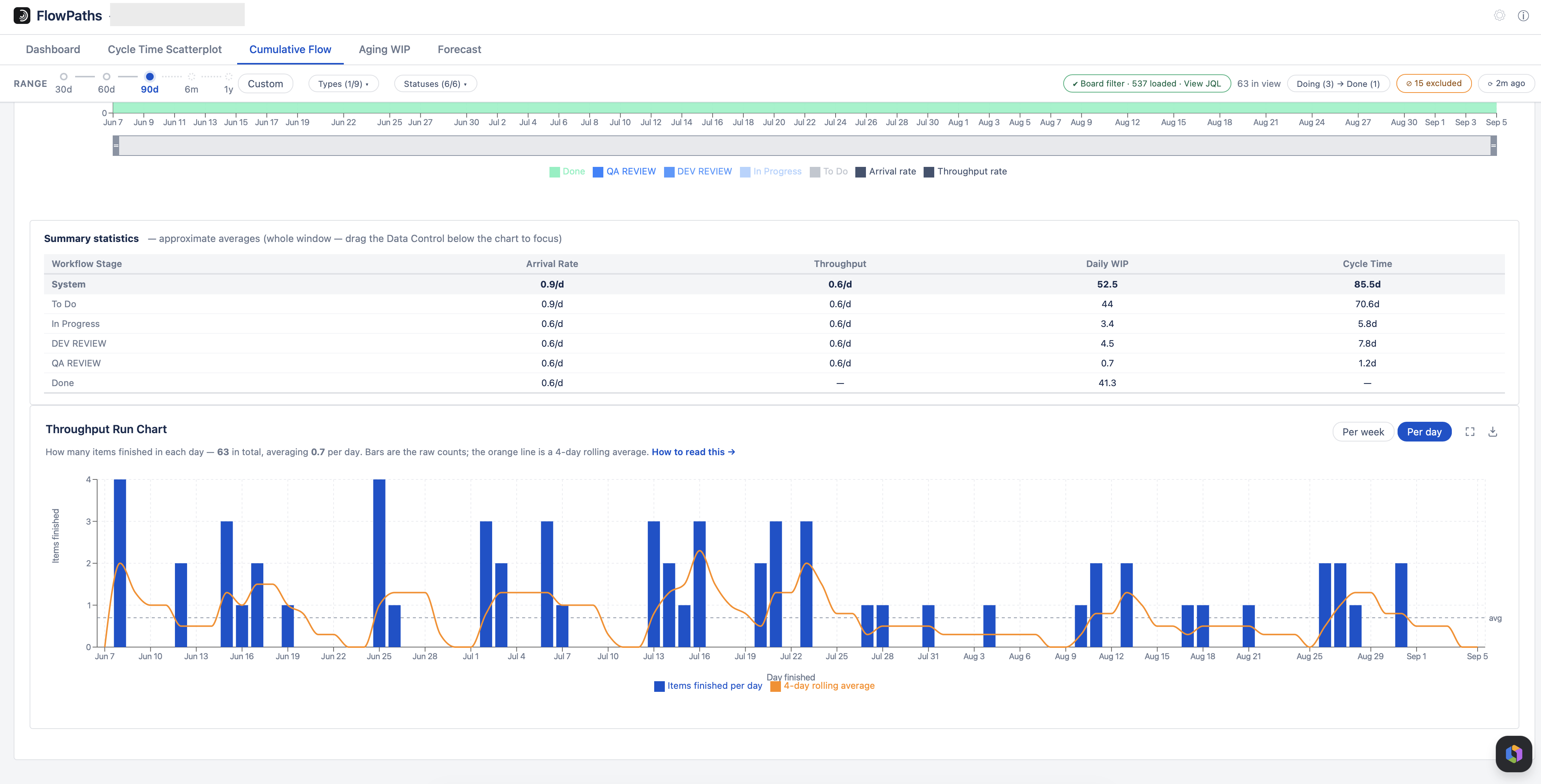
Below the CFD on the same tab is the Throughput Run Chart: one bar per week (or per day) counting the items that finished in that bucket, with a 4-bucket rolling average and the window mean.
It exists because throughput is a time-based metric, and time-based metrics need a time-based chart. The CFD's throughput rate line is a single straight average, and the “Throughput / week” figure on the Dashboard is a single number — both tell you the overall pace but deliberately flatten away variation. Two teams averaging 4 items a week look identical there, even if one delivers steadily and the other delivers 16 items every fourth week. That difference is what governs how predictable you are.
Where the rate lines start
The two grey average-rate lines begin at the first day the board has data in your selected window — not at the left edge of the range. If you pick six months but the board only started three weeks ago, the lines begin three weeks ago, and the rates are averaged over those three weeks.
That matters because averaging across empty months would understate both rates badly: thirty items arriving in a fortnight is roughly two a day, not the 0.2 a day you would get by dividing by a whole quarter. Only a leading empty stretch is skipped — a quiet period in the middle of the window is real signal and still pulls the average down.
- Level and stable — predictable delivery. This is what makes the Forecast reliable.
- Wildly uneven bars — batching. Work is being held and released together (a test phase, a release gate, an approval queue) rather than flowing item by item.
- A sustained trend in the rolling average is a real change in capability. A single tall or empty bar usually isn't.
- Regular sawtooth — a rhythm imposed by the process itself, typically a sprint boundary.
Weeks and days where nothing finished are drawn as zero, not skipped. Dropping them would hide genuine stalls and inflate every average taken over the series — the same reason the Forecast samples every calendar day, including empty ones.
Per-day buckets are noisier by nature: weekends and holidays read as zeros, and on smaller teams most days are 0 or 1 however healthy flow is. Weekly is usually the more readable view; switch to daily for high volume or when investigating a specific short period.
How to use it
- A CFD only shows the past — it's a retrospective tool, not a forecasting one. For forecasting, use the Scatterplot percentiles or the Forecast tab.
- Review it on a fixed cadence (weekly is common) so trend changes get caught early.
- Drag the Data Control (the brush below the chart) to recompute the summary stats for any sub-window.
- The status filter hides a status's band temporarily; to permanently remove a status from the metric, set it to Unmapped in Status Mapping.
This chart does not narrow
Unlike the other tabs, the CFD is a whole-system view: its rates, WIP and per-stage cycle times always count every item, whatever is ticked in the Statuses dropdown. Unticking a status hides its band, and the items in it are drawn in the previous visible band — so that band’s WIP and cycle time include the hidden status’s time.
The note above the chart states this in both states, so a narrowed measure elsewhere in the app is never mistaken for one here.