
Cycle Time Scatterplot
How predictable your delivery actually is, from real history.
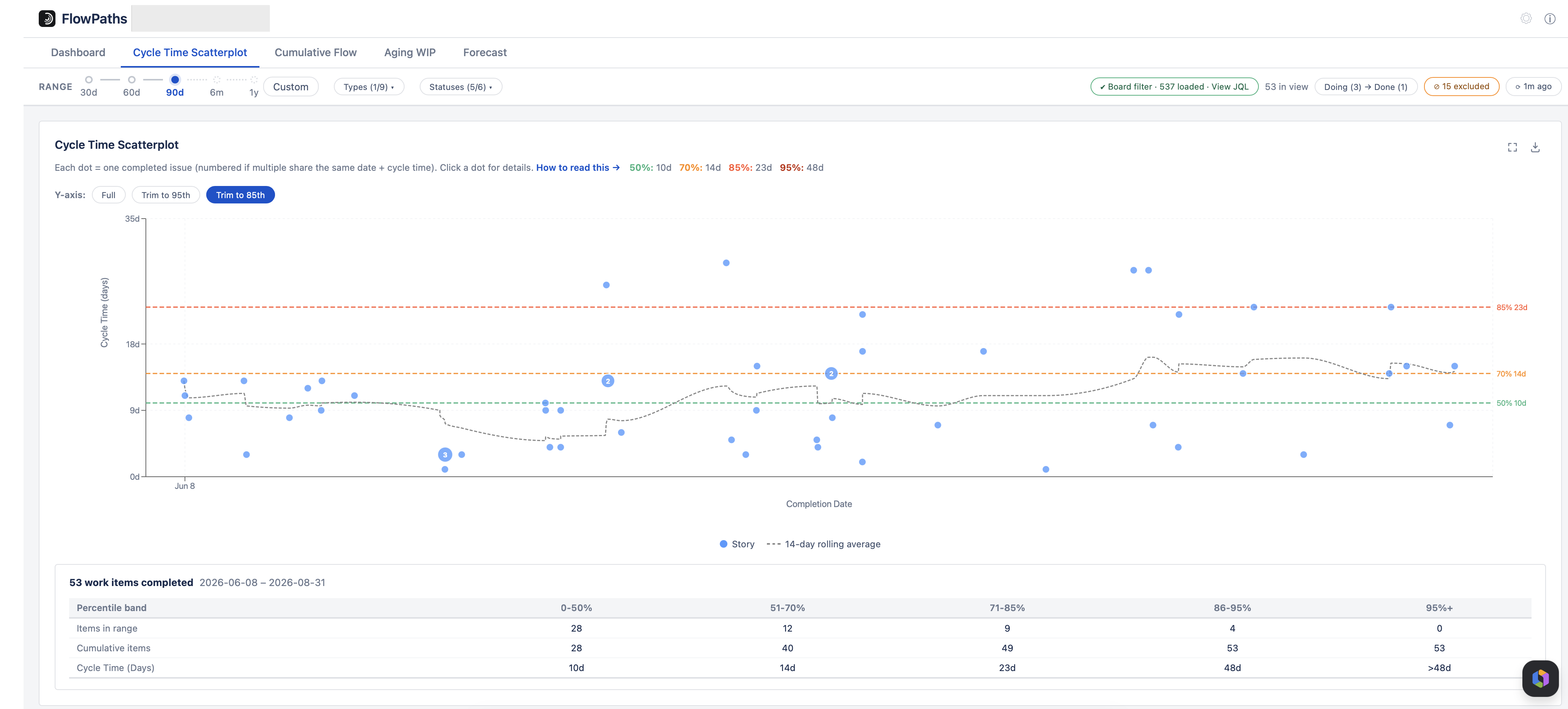
Each dot is one finished item. The cloud of dots is your delivery-time distribution — the core chart for seeing how consistent your team's delivery actually is, rather than relying on a felt sense of "we're usually pretty fast."
Reading a dot
- X (horizontal) — the date the item completed (reached Done).
- Y (vertical) — its cycle time, in days.
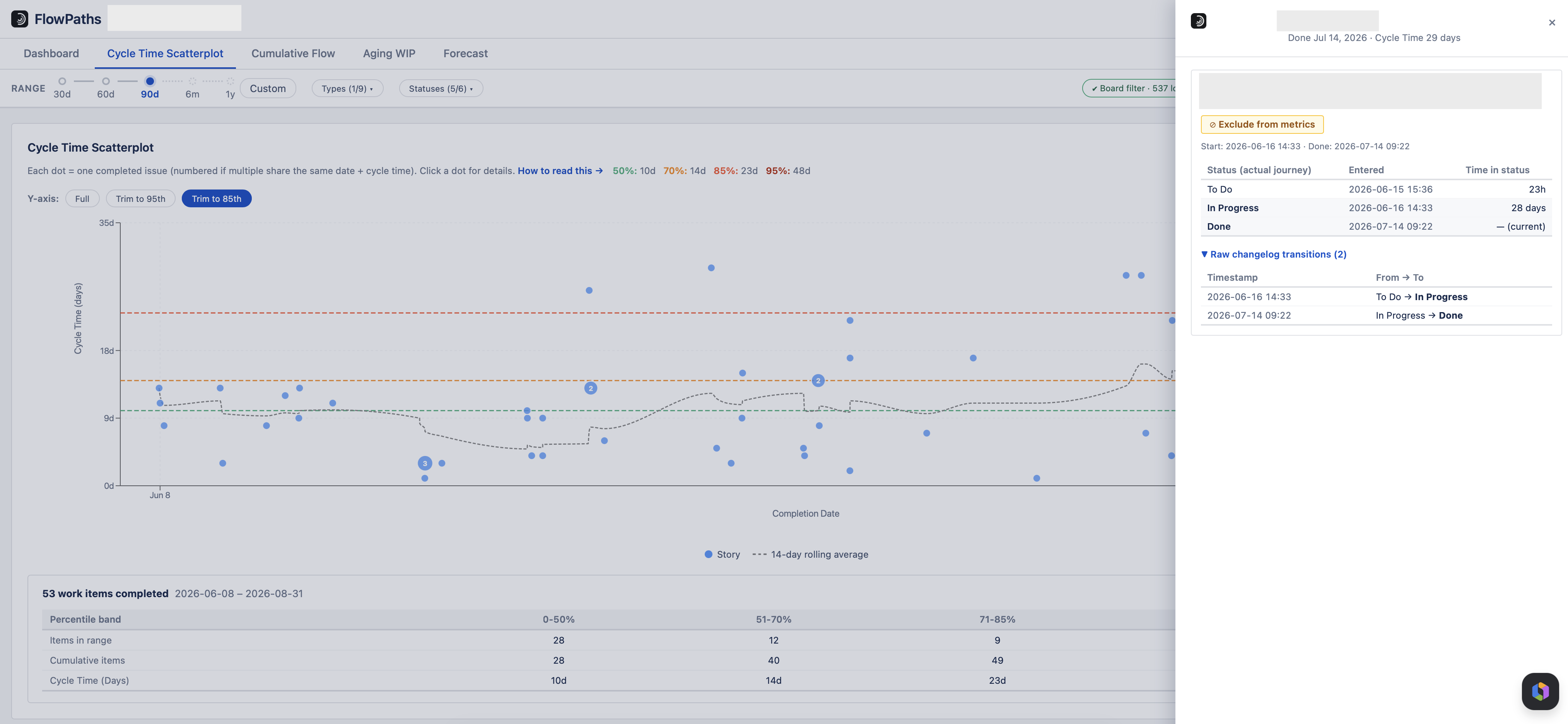
- A number on a dot means that many items share the same completion date and cycle time. Click any dot to see the item's full status journey with timestamps.
How cycle time is measured
Per item, from its own history: start = the first time it entered a Doing status (the commitment point); end = the first time it entered a Done status. Cycle time is the number of calendar days between those two points, plus one, with a minimum of one day — so an item that starts and finishes on the same day counts as 1 day, never 0.
The percentile lines are your SLEs
The dashed lines mark the 50th, 70th, 85th, and 95th percentiles. Read them as Service Level Expectations: an 85% line at 12 days means "85% of our items finish in 12 days or less." Use the 85th or 95th percentile for commitments — they're the same numbers used behind the scenes in the Forecast tab.
Useful controls
- Y-axis trim hides extreme outliers from view without dropping them from the underlying data or percentile calculations.
- Exclude removes a genuine one-off (e.g. a mis-tracked item) from every chart, not just this one. See Configuration & Filters.
- PNG export and Focus mode are available on every main chart via the icons in the top-right corner.
Measuring a single stage
Untick some of the Doing statuses and the Y axis becomes the time each item spent in the statuses still ticked — “how long does review take?” — with its own percentile lines drawn from the same narrowed measure. Items that never entered those statuses drop out of the chart. A note above the plot says which statuses are being measured. See the Statuses dropdown.