
Dashboard
Your command center — the big picture in one screen.
The Dashboard is where most people start each visit. It surfaces the headline numbers and tells you what needs attention today, without requiring you to read any of the individual charts first.
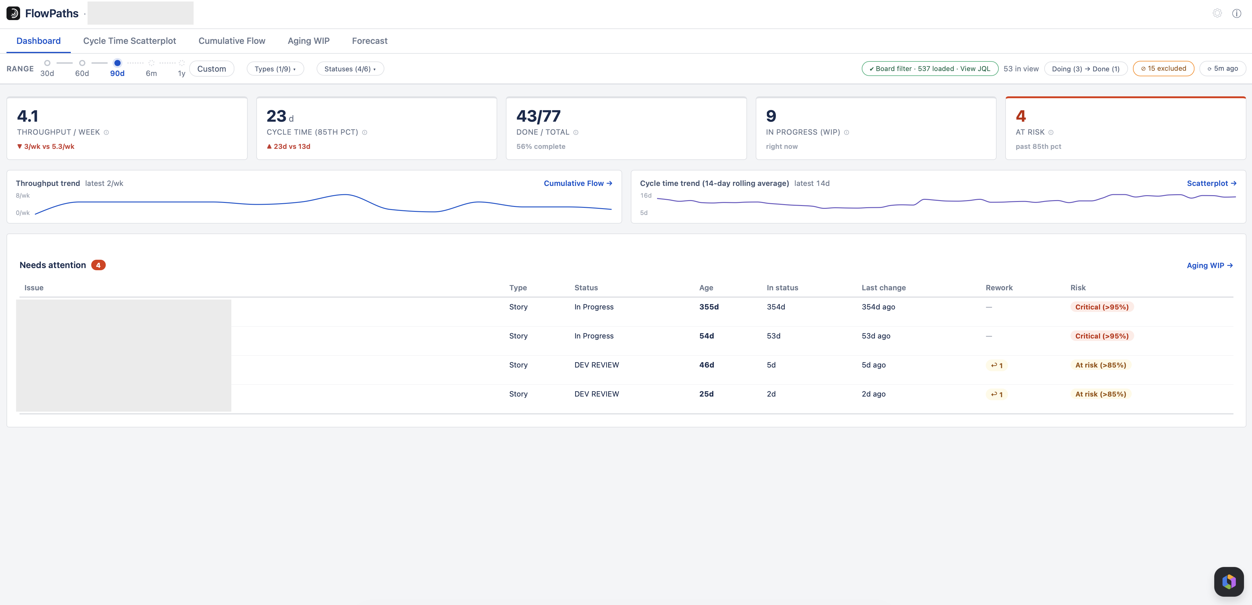
Headline KPIs
Four numbers, each with a trend indicator against the earlier half of your selected date range:
| KPI | What it means |
|---|---|
| Throughput | Items completed per week, averaged across the whole selected period — including weeks where nothing finished. Because it is an average over the window, changing the date range changes it: a longer range covering a quieter stretch shows a lower rate. To see week-by-week variation rather than the average, use the Throughput Run Chart. |
| Cycle time (85th percentile) | 85% of finished items completed in this many days or fewer — your practical delivery-time ceiling. This always describes exactly what you have filtered to, so narrowing to one issue type shows that type’s own figure. |
| Done / Total | Of the items created in the window, how many have reached Done. |
| WIP & at-risk count | How much is currently in progress, and how many of those items are already statistically at risk of running long. The at-risk count needs enough completed work to judge against — it reads “not enough history” until there are 7 finished items. See Aging WIP. |
Each KPI shows a ▲/▼ trend comparing the recent half of your date range against the earlier half, plus a small trend sparkline — so you can tell at a glance whether things are improving or slipping, not just what the current number is.
"Needs attention"
A ranked list of the open items most likely to slip — pulled from the same at-risk logic used in Aging WIP. This is designed to be actionable: work it top-down in a stand-up or WIP review, rather than reading through the whole board.
Measuring a single stage
Untick some of the Doing statuses and the headline numbers change meaning: the cycle-time KPI and its trend, item age and the at-risk count all become the time spent in the statuses still ticked, rather than the whole Doing → Done span. WIP counts only the items sitting in those statuses, and throughput counts only items that passed through them.
Done / total is the exception — it counts the items created in the period whatever path they took. Three numbers moving and one staying put is easy to misread, so that card’s own help says it is unaffected rather than leaving you to guess.
The cycle-time KPI relabels itself to Time in statuses, the “Needs attention” column header changes from Age to match, and a note above the KPIs states exactly what is being measured. Every KPI’s ⓘ describes what that number means under the current selection. See the Statuses dropdown.